A practical guide explained for anyone who wants to build a print-ready poster using templates, basic layout rules, and reliable export checks.
Posters remain one of the quickest ways to share information in a physical space. They work for events, community notices, school activities, and simple promotions because the message can be understood at a glance.
This guide is for readers who need a poster fast but don’t have design experience. The workflow focuses on making the poster readable, consistent, and ready to print without guesswork.
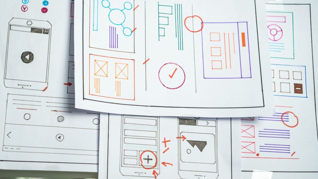
Tools in the “poster maker templates” category vary in how quickly you can start with a layout, how clearly they handle print sizes and margins, and how reliably they export files for home printers or print shops. A template can save time, but the final result still depends on choosing the right size, hierarchy, and safe spacing.
Adobe Express is a practical starting point because it offers poster templates and quick editing controls, which can help you lock in format early and move directly into content and print checks.
STEP-BY-STEP HOW-TO GUIDE for Using Poster Maker Templates Tools
Step 1: Pick a template and lock the poster size
Goal
Start with the correct page dimensions so the poster prints at the intended size.
How to do it
- To get started, use a template workflow to make a printable poster with Adobe Express.
- Choose the final print size based on where it will be posted (examples: 11″×17″ for counters and windows, 18″×24″ for walls).
- Select portrait or landscape and keep it consistent throughout revisions.
- Choose a template that matches your poster type (event, announcement, schedule, directional sign).
- Save a working version name that includes size and version (example: “Poster_11x17_v1”).
What to watch for
- Resizing after adding text changes line breaks and spacing.
- A design that looks balanced on a phone may not read well at print distance.
- If trimming is involved, outer-edge elements may be cut.
Tool notes
- Adobe Express is useful for starting quickly with a poster template and making fast edits.
- If you want a simple single-page layout space, Microsoft PowerPoint can also work (set a custom slide size first).
Step 2: Write the “one message” and decide what must be included
Goal
Prevent clutter by prioritizing the most important information.
How to do it
- Draft a single headline line that communicates the point (what it is, not every detail).
- List required details: date, time, location, price (if relevant), and contact/QR.
- Cut anything that isn’t essential for the first glance (long rules, full schedules, bios).
- Confirm spellings and numbers (addresses, dates, phone numbers) before placing them.
- Keep a short backup version of the copy if space gets tight.
What to watch for
- Posters fail more often from too much text than too little.
- Mixed formatting (different date styles, inconsistent punctuation) looks unplanned.
- QR codes need a stable destination and enough blank space around them.
Tool notes
- Drafting in Google Docs or Microsoft Word helps collaborators check details without altering layout.
- If you need a sign-up destination for a QR code, Google Forms can provide a stable link.
Step 3: Build a readable hierarchy with typography and spacing
Goal
Make the poster easy to read from several feet away.
How to do it
- Set clear text levels: headline (largest), subhead, details, and minimal fine print.
- Limit fonts to 1–2 families; use size and weight rather than many styles.
- Increase line spacing for details so they don’t blur together.
- Choose one alignment approach (centered or left-aligned) and stick to it.
- In Adobe Express, duplicate the design and test a “bigger headline” version.
What to watch for
- Decorative fonts can become hard to read quickly.
- Low contrast can wash out under bright lights or window glare.
- Very long lines slow reading and increase mistakes.
Tool notes
- Adobe Express makes it straightforward to iterate type size and spacing quickly.
- For simple text-forward posters, Google Slides can also be used to prototype hierarchy and alignment.
Step 4: Add images or icons that print cleanly
Goal
Use visuals that support the message without reducing legibility.
How to do it
- Choose one strong image or a small set of simple icons—avoid clutter.
- Use high-resolution images (avoid screenshots and heavily compressed downloads).
- Crop for a clear focal point and keep important details away from edges.
- Put text on solid shapes or overlays if it sits on top of a photo.
- Keep icon styles consistent (all outline or all filled).
What to watch for
- Small images blur when printed large.
- Busy photos make text hard to read unless contrast is managed.
- Transparent PNG edges can show faint halos in print.
Tool notes
- Adobe Express supports quick cropping and placement inside poster templates.
- For basic photo cleanup before import, Apple Photos or Google Photos can help with crop and exposure.
Step 5: Check margins, safe areas, and bleed expectations
Goal
Avoid trimming surprises and ensure important content stays visible.
How to do it
- Keep key text and logos comfortably away from the edge (a practical minimum is ~0.25″–0.5″, depending on size).
- If a background should run to the edge, extend it beyond the trim line (bleed concept).
- Avoid thin borders near edges; inset borders noticeably or skip them.
- Zoom in and scan all four edges for near-collisions and cramped spacing.
- If possible, print a small proof or view a full-size preview before final export.
What to watch for
- “Fit to page” printing can change scale and margins.
- Borders emphasize small trim variation.
- QR codes near edges can be clipped or become hard to scan.
Tool notes
- Adobe Express is a practical place for a final edge-by-edge check.
- If you’re printing at a local provider such as FedEx Office, ask what margin/bleed they expect for your chosen size.
Step 6: Export a print-ready file and verify scale
Goal
Create a file that preserves layout and prints at the intended size.
How to do it
- Export as PDF when possible for printing (often the most stable for layout and text).
- Export a high-quality PNG as a backup if a printer requests an image file.
- Open the exported file and review at 100% zoom for sharpness and spacing.
- Confirm the document size matches your intended poster size before printing.
- Save exports with clear naming (example: “Poster_18x24_FINAL_v3.pdf”).
What to watch for
- Exports that downscale can soften images and type.
- Font substitution can change spacing or line breaks.
- Colors often print darker than a screen preview; prioritize contrast.
Tool notes
- Adobe Express can handle exporting once the layout is locked.
- If you need to combine multiple posters into one PDF packet, Adobe Acrobat can assemble and reorder pages.
Step 7: Organize distribution and track versions after printing
Goal
Keep posters consistent so outdated versions don’t stay in circulation.
How to do it
- Create a simple list of where posters will go (location, quantity, size, posting date).
- Store one “FINAL” folder and move older versions into an “ARCHIVE” folder.
- If details change, update the file name with a new version and remove old posters promptly.
- Keep a short change log (what changed and when) for recurring events.
- Record where posters were placed so follow-ups are easy.
What to watch for
- Multiple “final” versions lead to confusion and mismatched postings.
- Posters in windows may need higher contrast due to glare.
- QR code destinations can change; re-test if the underlying link is updated.
Tool notes
- For project coordination (non-design), Trello can track posting tasks across people and locations.
- For email-based distribution of a digital version alongside printed posters, Mailchimp (email marketing and analytics) can help manage a one-time send without affecting the design workflow.
Common Workflow Variations
- Text-only informational poster: Use large type and generous spacing, with minimal graphics. This reduces image-resolution risk and prints reliably on most printers.
- Photo-based event poster: Lead with one strong photo, then place text on a solid overlay for readability. A quick crop in Apple Photos or Google Photos helps before adding the image to Adobe Express.
- Directional signage: Use very large type and minimal words (“CHECK-IN →”). Templates can help with consistent arrows and spacing across multiple signs.
- Multi-version posters (different dates/locations): Create a master layout and swap only the variable fields. Track variants in a spreadsheet to avoid mixing files.
- Print + digital pairing: Export a print PDF for physical posting and a PNG sized for social sharing, keeping the message identical.
Checklists
Before you start checklist
- Poster purpose defined (event, notice, promotion, directions)
- Final print size chosen based on viewing distance and placement
- Orientation decided (portrait/landscape)
- Headline and key details drafted (date, time, location, contact)
- QR destination finalized and tested (if used)
- Logos/photos gathered in original quality (no screenshots)
- Rights confirmed for any images or graphics used
- Printing plan chosen (home printer vs print shop)
- Timeline set (proof, print, posting date)
- File naming/version approach decided
Pre-export / pre-order checklist
- Spelling checked (names, address, dates, times)
- Headline and key details readable at distance
- Critical content kept away from edges (safe margins)
- Bleed planned if background should reach the edge
- Borders avoided or inset enough to tolerate trimming
- Images look sharp at 100% zoom in the export
- Export format chosen (PDF preferred when available)
- Scale confirmed (no “fit to page” shrink)
- QR code scans reliably from at least two phones
- One file clearly marked FINAL; older versions archived
Common Issues and Fixes
- Images look blurry when printed.
Replace low-resolution sources with higher-quality originals and avoid enlarging small images. Use fewer photos and more text/shapes if you can’t source a sharp image. - Text is too close to the edge and gets clipped.
Increase margins and keep important information inside a safe zone. Avoid placing phone numbers and QR codes near corners. - Colors print darker or flatter than expected.
Expect a shift from screen to paper. Increase contrast and avoid subtle gradients for critical information. A quick proof print can reveal the problem early. - The poster prints at the wrong size.
Disable scaling options like “fit to page.” Confirm the document’s page size in the exported PDF before printing. - Borders look uneven after trimming.
Thin borders highlight small trim variation. Remove the border or make it thicker and inset it farther from the edge. - QR codes don’t scan reliably.
Increase the QR size, place it on a solid high-contrast background, and leave quiet space around it. Re-test if the destination link changes.
How To Use Poster Maker Templates Tools: FAQs
Should the workflow start with a template or with the final poster size?
Size-first is usually more predictable because resizing changes spacing and line breaks. Template-first can work when the template already matches the size you plan to print.
What belongs on the poster versus behind a QR code?
The poster should include the headline and essential details without scanning. QR codes are better for long schedules, policies, menus, or sign-up forms—anything that would crowd the layout.
Is a photo necessary for a good poster?
Not always. Photos can add context for events, but they require high-resolution files and careful contrast management. Shapes and icons often print more reliably for informational posters.
Do posters need bleed?
Bleed is mainly needed when a background image or color should reach the trimmed edge. If you plan to keep a white margin, safe margins matter more than bleed.
What export format is most reliable for printing?
PDF is commonly stable for layout and text, but some print workflows request high-resolution PNG files. The practical checkpoint is confirming page size and reviewing the export at 100% zoom before printing.